
This is the continuity & end of the article Basic User Experience & Interface Tips | Part 1.
Here is what is going to be covered:
- List Views: easily filter down data
- Page Layout: break those fields up nicely
- Lightning Pages: streamline them!
1. List Views: easily filter down data
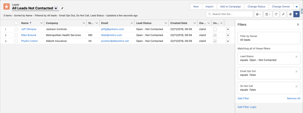
Since you previously set up your Apps for the Users, they are going to navigate the org objects via the Object tabs and land on standard List Views created by Salesforce, most certainly the Recently Viewed one that is pinned by default. These might not be sufficient for your users to find the data they are looking for.
Also, List Views are basically just lists of records. These can be huge when no or only few filters are applied depending on the amount of data stored in your org. Creating custom filtered List Views to show your users relevant list of records will categorise a bit more the records and save them heaps of time & clicks to your users!
Basic Tips:
- check the fields showing as columns on the standard List Views:
- they might not be all used or important to see here and need to be removed
- important ones could be added
- the order could be improved
- for the Recently Viewed List Views, update these in Set Up > Object Manager > {Object} > Search Layout > Default Layout > Edit (this can be done by Profile)
- create custom List Views filtered on relevant information to break down the data in smaller groups
- record types
- status/stages
- new or closed today/this week
- ownership
- location
- other any relevant key fields depending on your business
- check what List Views need to be available to which Users or groups of Users
- all users certainly don’t need to see all List Views, otherwise their list of List Views will be very long & unpleasant to navigate
- give access to Roles, Roles & Subordinates, Public Groups depending on their needs
- train your users on creating their own!
- if the “Create and Customize List Views” is given in the Users’ Profile or Permission Set, Users are able to create their own List Views or to clone existing ones to amend them to their need
- this is a great tool for users to filter the data to their need without running a report or impacting global List Views
- train them on the filters they can play with so they gain autonomy and find easily the data they are looking for
2. Page Layout: break those fields up nicely
Now that they found the records they are looking for, Users are going to open them. They can contain a loooot of information & component. Let’s not loose them and set up a nice page layout, compact layout and actions so that they find and store information properly.
Basic Tips:
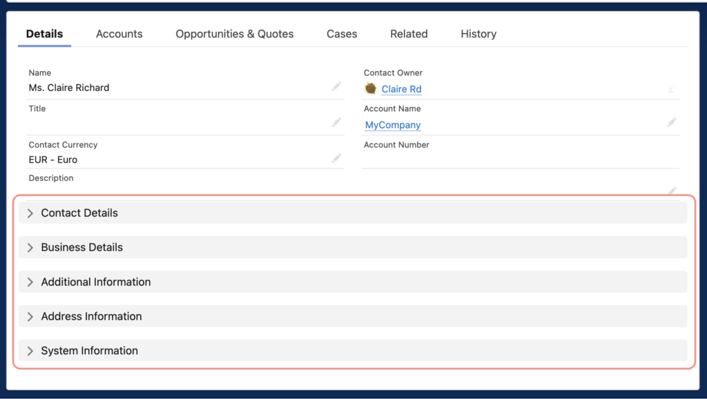
- Page Layout: the Page Layout can contain a lot fields which can make the page hard to read or to comprehend.
- Sections: make use of sections to break these fields down into relevant category (contact details, business details, marketing information, … and other business specific details that can be grouped together)
- Field Order: the same way you grouped fields by section, try ordering them inside these sections into a logical order. It can be by field format, type of information, chronological order it needs to be read by or filled in…
- Long & Rich Text Fields: these can contain a lot of text. Create a specific section for these kind of fields, optionally hide the section name, and select the 1 column format so that the fields spread across the width of the page
- Dependent fields: as the name says, they are dependent, you need a parent value to input a child field. Avoid having the user looking desperately for the parent or the child field, keep them close together when possible.
- Blank spaces: for a nice touch, keep it nice and tidy by adding blank spaces where you need to separate fields inside a section or balance them out
- Compact Layout
- It can show up to 7 fields on the Highlight panel at the top of the page, under the record name, make use of it!
- Located at eye level, this is what the users are going to see right away when opening the record, it needs to be key information such as contact details (email, phone…), location, record ownership, parent record..
- Actions
- Actions allows Users to perform something on the record such as Edit, Change Record Type, View Hierarchy, Delete…
- Show only the necessary ones
- Order them nicely so that the most frequently used show first
- Show only a certain number so that the least used are hidden under the dropdown (select that number in the Highlight Panel in the Lightning Page)
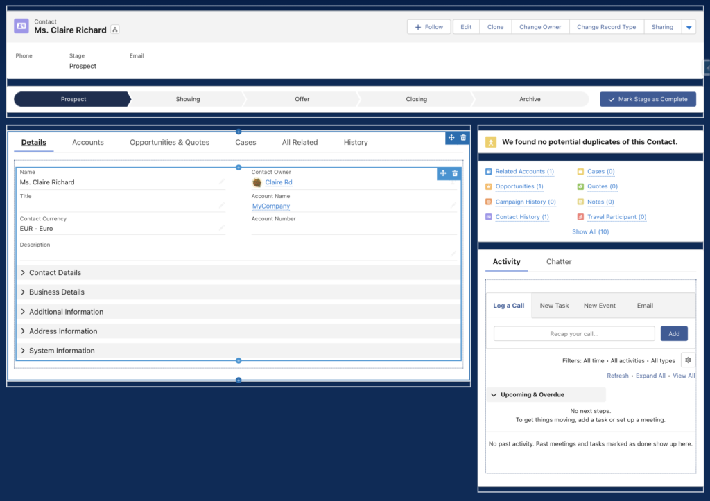
3. Lightning Pages: streamline them!
Last but not least, my favorite place to spice up the UI! Where everything shows together to create the nice page your users are going to be looking at everyday.
Basic Tips:
- When possible, trying to have the same kind of set up and logic across Objects helps Users to always know where to find what kind of information or actions.
- At the top of the page, the Highlight Panel is perfect to show the record name and its main details that you set up earlier in the Compact Layout.
- If an Object contains a stage or status field, adding the Path component is perfect to have it right at the eye level under the Highlight Panel and drives action.
- If the Object has duplicate rules applied to it, adding the Potential Duplicate element to the page and making sure it is visible upfront ensures that duplicates are not missed.
- A component I love to add at the top of the page is the Related Lists Quick Links: it shows right away an overview of what is linked to that record, their numbers, and can be hoovered to get a more detailed glance. Magic!
- Breaking down nicely and logically these related list under Tabs helps Users have less scrolling when they contain a lot of records. Determine which Tab needs to open first by default when a record is opened.
- Speaking of related lists again, a quick win is selecting the “Enhanced List” related list type in the Single Related List component so that it shows up to 10 fields, great thing for a quick overview of the records without opening them!
- Finally, I tend to group the Activity Timeline & Chatter Feed in two other tabs on the side so that Users can take action or collaborate with colleagues without loosing sight of the Details tab or any Related Lists.
Hope this helps! And please share your own tips if you have ones 🙂